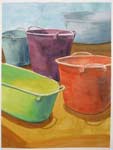
My Watercolour Course, Weeks 11 Onwards
Click here for Weeks 1 to 5 and Weeks 6-10 of the watercolour course I am taking.
After the Holidays we are back at Barry Coombs Studio lessons. The link connects to his Studio Lessons. He posts the exercise and photos of all the student's work.
Barry has a nice style of teaching and I feel I have progressed steadily. Before each class he gives a demo which are really helpful.
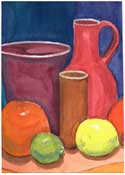
Week 11, Citrus and Pots

This weeks theme was "Simplification, value and colour"
The boss also suggested strongly that all this could be accomplished using only primary colours.
The primaries I used were Da Vinci's Aureolin Mixture yellow, Cobalt Blue, Quinacridone Red. The yellow is particularly nice to use. If I can manage to keep it clean it produces clear oranges and nice bright greens.

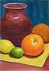
When I got home I practiced making oranges. In particular I practiced getting a nice bright orange colour. During class, my paintbrush had a bit of colour on it and darkened the oranges above. (I cheated though with the background and tried out a new colour, a lovely turquoise.)

On the left an experiment using pale unsaturated colours. I tried to give volume and suggest space with subdued tones. I prefer bright colours. Above to the right, simplified shapes with minimal shading, simple values mixed from primaries only.
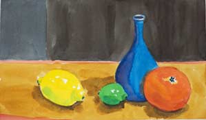
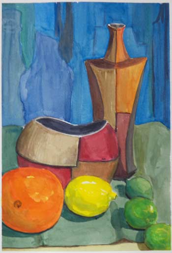
I'm trying to give depth. I did this by keeping the forward objects brighter, smaller and less detailed.
I cheated I confess and added phthalo green to the front limes. The primaries were not quite bright enough. Its a wonderful electric green, absolutely vibrant and vulgar but it adds extra impact.
I don't think this painting is particularly pretty, but it has depth and the eye is drawn back.
That's it for oranges and lemons, I've eaten the models...
Week 12, Old Boots and Shoes

Such fun! This week Barry had a whole collection of shoes and old boots piled up. It took a long time to draw and most of us had to take our unfinished paintings home to complete.
We were instructed to simplify!
Not much time to paint this week. It's Boat Show Week!
Week 13, Brass and Kiwis


Barry chose brass objects and kiwis plus avocados. The colours of the kiwi are surprisingly like the brass. This is is quite difficult to do. At least I struggled. The left painting is what I did during class, the right what I did at home.
I guess some subjects are just harder and I will simply just have to work at it and gradually get better... sigh.
Week 14, Wellies and Mittens
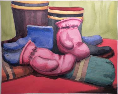
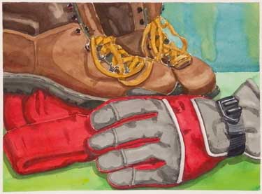
Its been snowing steadily and Barry chose mittens and wellingtons for our drawing subject.
The idea was to do some graded washes and wet on wet shading. Pretty tricky really. Easy to understand but...
I sort of got tangled up with the shoelaces :) I really enjoyed this subject. Another thing I did is a whole page of little swatches with wet on wet shading.


More at home experiments. My goal was to use wet on wet shading. I think it worked but the result is quite unremarkable. The flat pot at the right is a 15 minute quick study. Nicer looking than the almost 3 hour painting on the left.
It's tricky to figure out why a painting delights the eye while another, just as well done technically, has no life whatsoever. Barry brushed on this last class by talking about what the painting was about. He was talking about the kids mittens and would point to one mitten and say, 'that's the subject'. Or he would say 'I'm not sure what this painting is about'.
Week 15, Vegetables on a Wooden Box
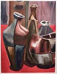
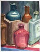
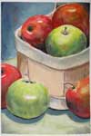
The top paintings were done in class. We are supposed to abandon the soft graduated edges and practice hard edges.
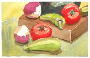

The focus of this week is crisp edge shading, as opposed to the graduated blends we have been doing. It is quite an adjustment to try and figure out where to place the darker areas and it is quite shocking to the eye. It's very hard not to try and blend the new colour in. The big danger is to want to go back in and reduce the impact of the edge. That of course is a mistake because that is what gives the technique it's strength.
As a comparison look at the painting immediately above this week. They are shaded wet on wet and the areas of dark and light are gradual.

My homework on the left. It's a little less rough than the top. I'm not sure I like that method much. Maybe I was just getting used to painting wet on wet. We have been instructed to get some square brushes, or rather square with an angle. Up till now the brushes have been round sable brushes, for me mostly #10. (I've been comparing sables with synthetic sable. The real ones take on more water or colour.)
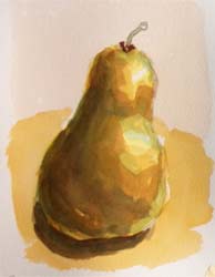


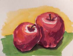


I cut up a bunch of little papers and did a series of quick sketches using hard edge technique.
Success was mixed. I think I'm starting to understand a bit better but I'm finding it it quite hard. There is a lot more to still life than I ever imagined.
[HOME]Email Christine
After a brief pause for the holidays, we started painting again.
Barry prepares his classes so that skills gradually build from previous lessons.
We have covered many topics. He introduced wet on wet painting, grey underpainting and the effect of distance.
Barry has talked about the way background influences the watercolours and the tonal relationships between objects.
Its very interesting to see how others interpret the assignments. Group work allows me to compare and contrast, and broaden my understanding.
I know that learning to paint watercolour is not a simple process and the gains will be gradual, but I find it frustrating. Not least of my problem is not knowing how I want the final painting to look. Not seeing really. Half of my problem is VISION or lack of it.
Winsor & Newton Professional Water Color Compact Set
I also have a number of DaVinci Paints and I really like them, particularly the yellow: Da Vinci Paints Watercolor Paint Quinacridone (Set of 6)
The same thing goes for paper, Cold Pressed Arches paper is what I use, cold pressed. Hot pressed is much smoother.Arches Aquarelle Watercolor Block 140 lb. cold press 9 in. x 12 in. pad
As far as paintbrushes I'm not as fussy and I've found that many of the new synthetics work really well. Choose a round one with a good point, I also like a nice flat 3/4 inch brush. Princeton Series 4050 Synthetic Sable Watercolor Brushes 6 short handle round
